Last weekend my boy and I attended one of my FAVORITE events here locally, our Indy Home-A-Rama. This is something I look forward to every year, and believe it or not, our son loves it too. That is, until we get to about the fourth house…then he's done. ;)


He was a trooper this year because there were 11 houses! I think that's the largest we've had by far. I can't remember more than maybe six or seven in the past. If you are near Indianapolis this one is so worth checking out! (This time it's located in Westfield.)
I always love to share the highlights of each home with you here and because there were so many I'm going to break this up into a few posts. All of the homes were beautiful, but some I loved more than others, of course.
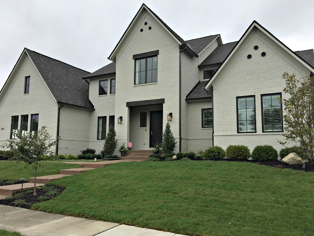
I did my best to keep each house straight -- I took a ton of pictures! I will share these in order of the tour, and the first house had windows I was drooling over:

Builder: Wedgewood Building Company
Designer: Thomas and Jayne Interior Design
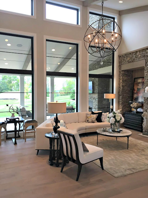
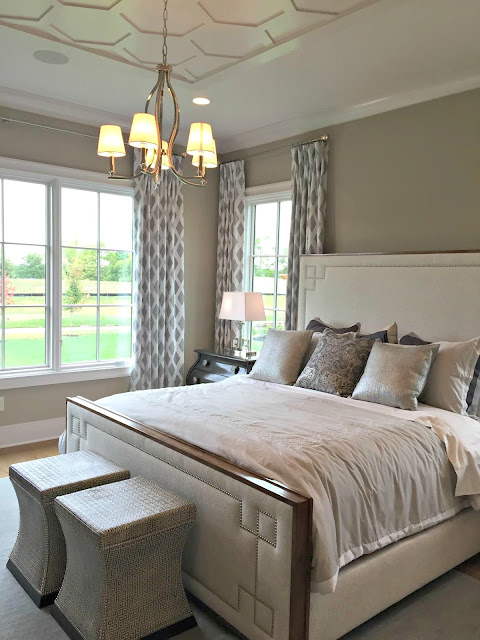
They were absolutely STUNNING. I'm obsessed with black mullions and if we ever build again someday, I. want. These were floor to ceiling and really amazing:
Of course you'd live in a fish bowl and they'd be crazy expensive to cover, but if you live in this house you have the money. ;)
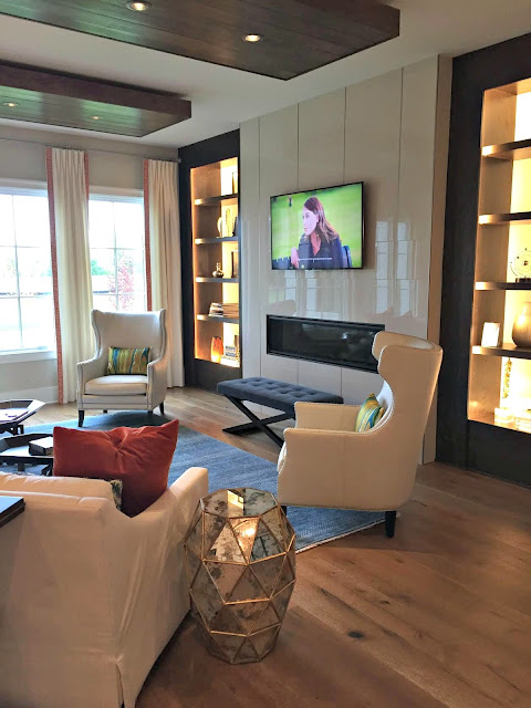
I loved the main living space -- those windows make the whole room, right?:

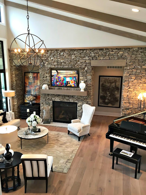
The ceiling was angled up with wood beams:

The stone wall was awesome -- not something I would pick but it was really cool:

Here's a look at my beloved windows from outside:

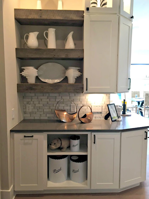
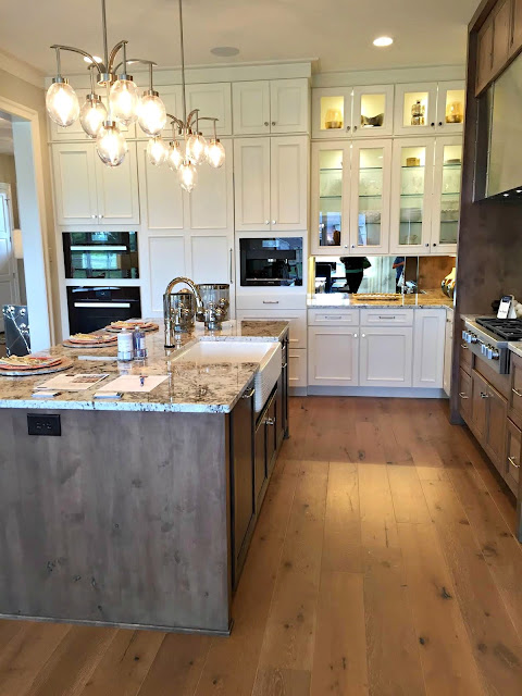
The kitchen was beautiful, of course, but a little smaller than I expected:

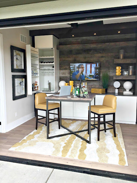
This room was right next to the kitchen and I would have used some of that space for the kitchen:

I LOVED it though -- what a fun hang out space. The doors to the patio open up completely so it's really a great indoor/outdoor space. I love the wood wall and shelves and that awesome built in for glasses (I see a tap in there too!).
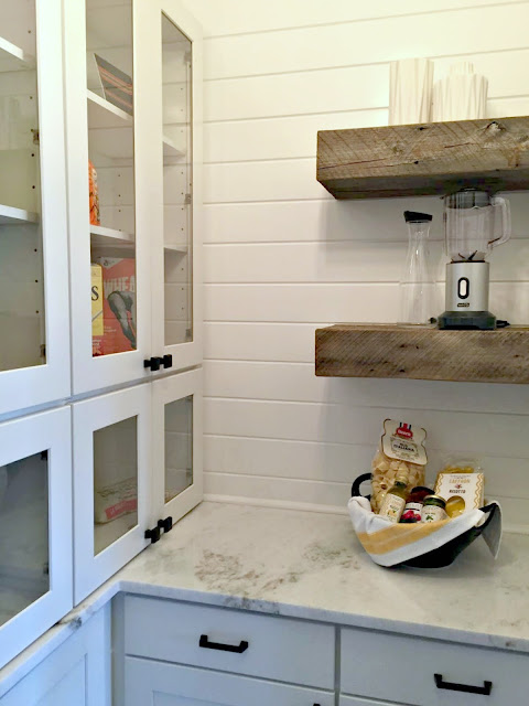
The pantry was a good size and the finishes crazy good. Wood shelves, granite, glass cabinet doors and shiplap walls, in a pantry? Dreamy:

I liked that there was a little butler's pantry-type area around the corner from the kitchen. It wrapped around over by the pantry and would be a great spot for a coffee or animal food station:

The windows sold me on that house -- I just loved them. I must have forgotten to take a photo of the outside of that one but it was beautiful exterior.
The second house had a "Fixer Upper" feel on the exterior:

Builder: Old Town Design Group
Designer: Everything Home
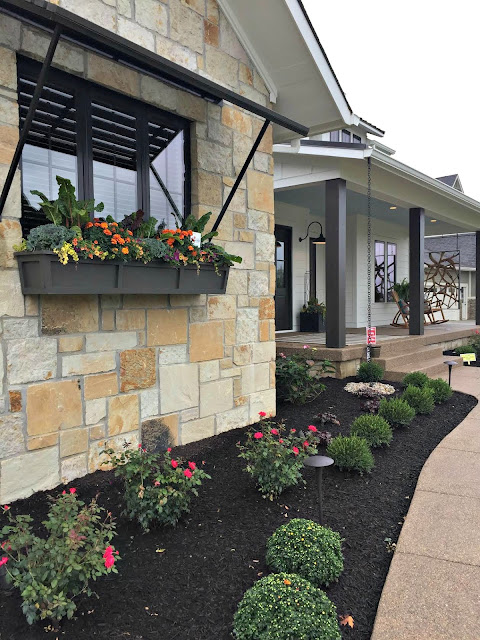
I loved the modern farmhouse feel! Those window boxes were huge and beautiful:

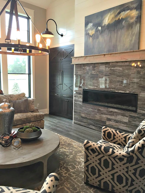
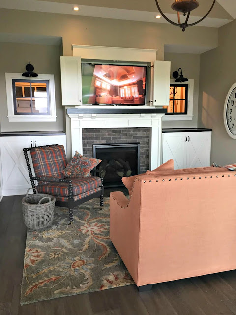
I was surprised by the fireplace in the living area -- it was more modern than I was expecting:

Most of the house had an elegant rustic vibe, but the skinny fireplace felt more modern to me.
The eat in kitchen area was beautiful:

There were definite trends I noticed throughout all of the homes -- I think I only saw one dedicated dining room. They may be a thing of the past! And there were no separate living and family rooms -- only one large gathering room off the kitchen (and additional space in the basements). These are both trends I would incorporate into a home if I ever did it again!
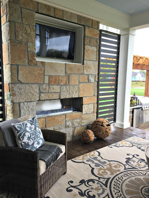
This house also had a room off of the kitchen that opened to a patio:

I really like those slatted walls for privacy.
This is the hearth room that opened to the patio -- so cozy!:

Another trend I loved -- interior windows. I've actually considered adding a couple in our house over the years so I was happy to see that I'm not crazy thinking that. ;) They really did allow for natural light to spread throughout the house.
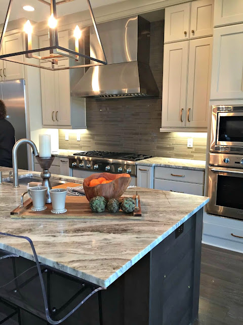
The kitchen had a darker island and light cabinets:

I liked this separate built in area for coffee or whatever:

That dark shiplap with the dark shelving is so striking.
The master had gorgeous wood beams and high ceilings:

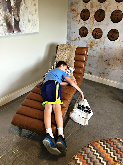
Did I say it was four houses in that the Bub was done? I meant the second house in:

Ha! Luckily there were some fun kid's spaces coming up. (I'll show you that house next week!)
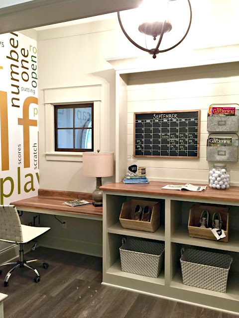
This little office space on the way to the garage was a cool spot:

You can see those interior windows again -- I just love that.
The third house had a full brick front:

Gradison Design Build
Gadison Interiors/Kittle's Design Studio
I was surprised at the inside -- this one was more modern:

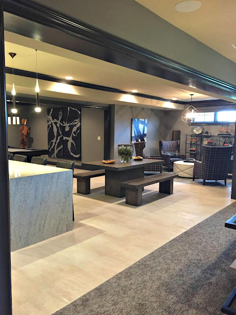
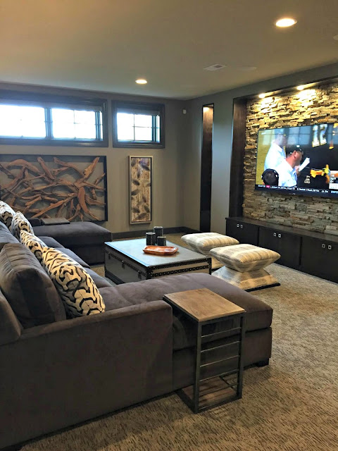
The basement continued the sleek design:

The TV side was more cozy and I thought the stone wall behind the TV was really cool:

The basements all killed me -- they all felt like the entire size of our whole house! And the finishes were so high end -- look at that waterfall counter!:

I thought the bedroom in this house was beautiful -- look at that detailed ceiling!:

And I LOVED the bathroom!:

I loved the vanity design, the hexagon tile that tied into the bathroom ceiling and that beautiful sparkly tile in the shower! (Those were small hexagons as well.)
The stairway was just lovely -- I thought this was such a beautiful idea for those big staircase walls so many of houses have now:

It looked like it was painted on but it could be wallpaper. Love!
My favorite room in this house was the kitchen. Oh my, it was gorgeous and unique!:

Isn't that hood and stove area amazing? I just thought it was awesome. It was more modern than my style but man, I can so appreciate it. The backsplash was a mirror with an antiqued/smoked look and it worked so well in here:

I wished that the island was the same beautiful wood tone as that cooktop surround:

But, WOW. Stunning, right? I loved it!
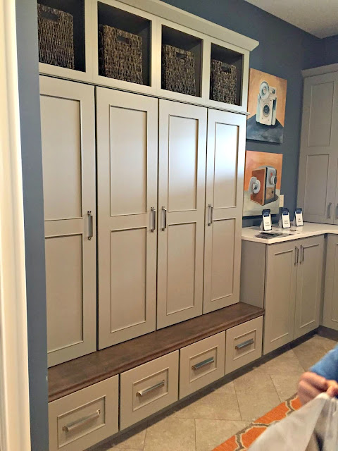
Finally, this house had an awesome mud room on the way out with tons of storage:

Whew! That's enough for today! Like I said -- if you are near Indy this one really is a must-see. Of course I am barely scratching the surface of these spaces. ALL of the designs were stunning. I'll be back to share some more favorites next week!
Where there any rooms you really loved? Any trends you've noticed in newer homes as well? Have a great weekend my friends!

Comments
Post a Comment